diff options
| author | MarcoFalke <falke.marco@gmail.com> | 2021-03-05 08:20:41 +0100 |
|---|---|---|
| committer | MarcoFalke <falke.marco@gmail.com> | 2021-03-05 08:20:44 +0100 |
| commit | ed25cb58f605ba583c735f330482df0bf9348f3a (patch) | |
| tree | e91489739baafd70ca36d35f2a3c33eb87df709b | |
| parent | f7653eb5ae6ec39ac28f638d4b69efe024dc874e (diff) | |
| parent | 67c59ae4793b1a5ebe0c4c542abf3c095e6a658b (diff) | |
Merge bitcoin-core/gui#217: qt: Make warning label look clickable
67c59ae4793b1a5ebe0c4c542abf3c095e6a658b qt: Make warning label look clickable (Jarol Rodriguez)
Pull request description:
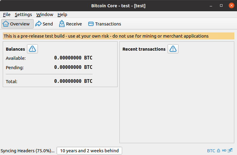
The warning icon on the overview page indicates that there is something important the user should know about, but a user may not be aware that they can click it because, on `master`, the warning label does not look clickable. As detailed in issue #23, the reason to make it look clickable is that it if they "had a more clickable-appearance (borders or beveled button edges) it could help users more quickly understand what they are being alerted to."
This PR removes the `flat` property from both `QPushButton`'s to make them look like a button, and therefore clickable. Furthermore, it updates the `Maximum Width` to `45` to fix the small hit-box issue outlined in issue #215.
Below are screenshots showing how the warning icon looks under `master` and this `PR`:
**macOS 11.1: Qt 5.15**
| Master | PR |
| ----------- | ----------- |
| <img width="754" alt="Screen Shot 2021-02-22 at 5 00 40 PM" src="https://user-images.githubusercontent.com/23396902/108776135-f6d50380-752f-11eb-9f96-25163c6a2a02.png"> | <img width="754" alt="Screen Shot 2021-02-22 at 3 08 40 PM" src="https://user-images.githubusercontent.com/23396902/108776068-e0c74300-752f-11eb-9545-3580e2b8f187.png"> |
**Ubuntu 20.04: Qt 5.12**
| Master | PR |
| ----------- | ----------- |
| <img width="783" alt="Screen Shot 2021-02-22 at 4 57 32 PM" src="https://user-images.githubusercontent.com/23396902/108776249-284dcf00-7530-11eb-8325-7fe13a9243a7.png"> |  |
Closes #23
Closes #215
ACKs for top commit:
Talkless:
tACK 67c59ae4793b1a5ebe0c4c542abf3c095e6a658b, tested on Debian Sid. Does look as expected.
Tree-SHA512: 2b7302fb990ea49e2f01df6f4a23e2bc3de0797da89deaeb299742e6b285a0c21ea80d8259dc0222640cccc2bccc4ea09df443b9a11bf8b88a828e5fb2aec12c
| -rw-r--r-- | src/qt/forms/overviewpage.ui | 10 |
1 files changed, 2 insertions, 8 deletions
diff --git a/src/qt/forms/overviewpage.ui b/src/qt/forms/overviewpage.ui index b82143e1ba..f85de0811a 100644 --- a/src/qt/forms/overviewpage.ui +++ b/src/qt/forms/overviewpage.ui @@ -68,7 +68,7 @@ </property> <property name="maximumSize"> <size> - <width>30</width> + <width>45</width> <height>16777215</height> </size> </property> @@ -89,9 +89,6 @@ <height>24</height> </size> </property> - <property name="flat"> - <bool>true</bool> - </property> </widget> </item> <item> @@ -406,7 +403,7 @@ </property> <property name="maximumSize"> <size> - <width>30</width> + <width>45</width> <height>16777215</height> </size> </property> @@ -427,9 +424,6 @@ <height>24</height> </size> </property> - <property name="flat"> - <bool>true</bool> - </property> </widget> </item> <item> |
